Form Builder
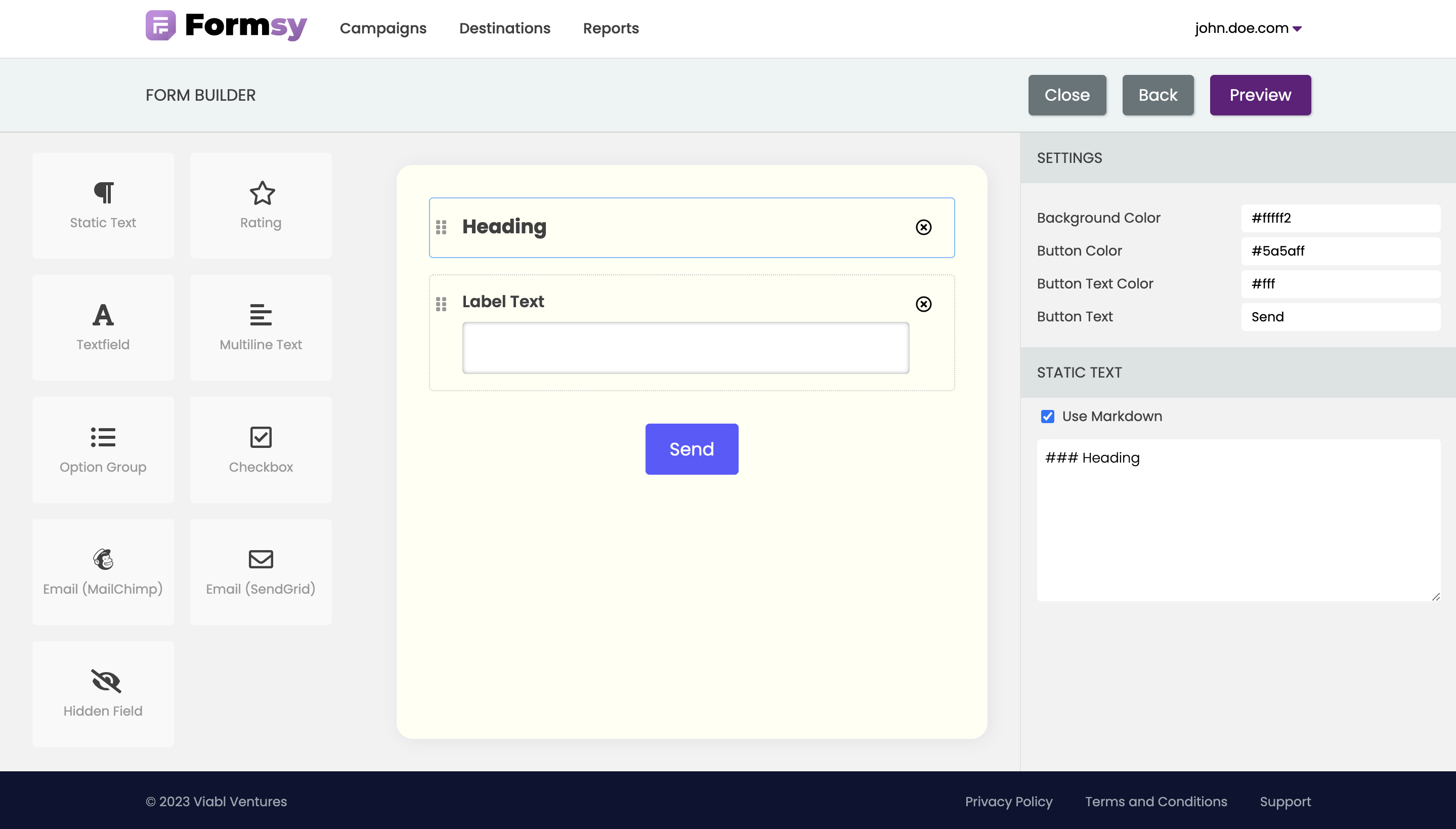
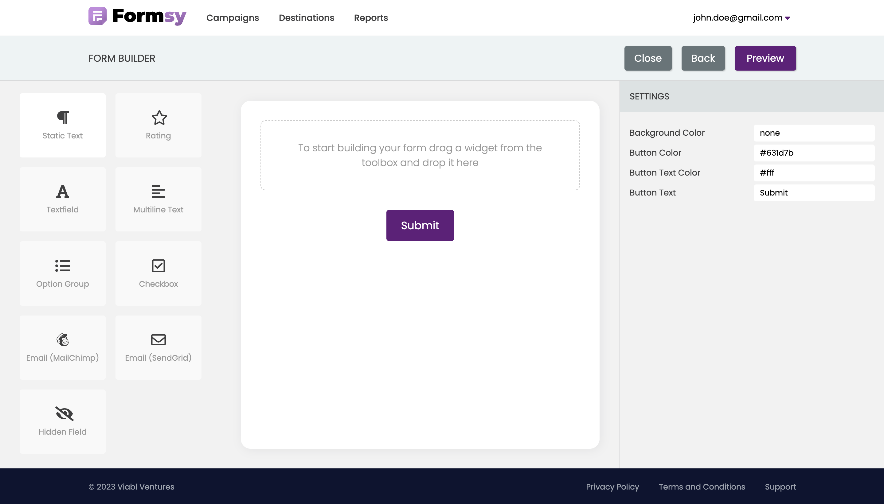
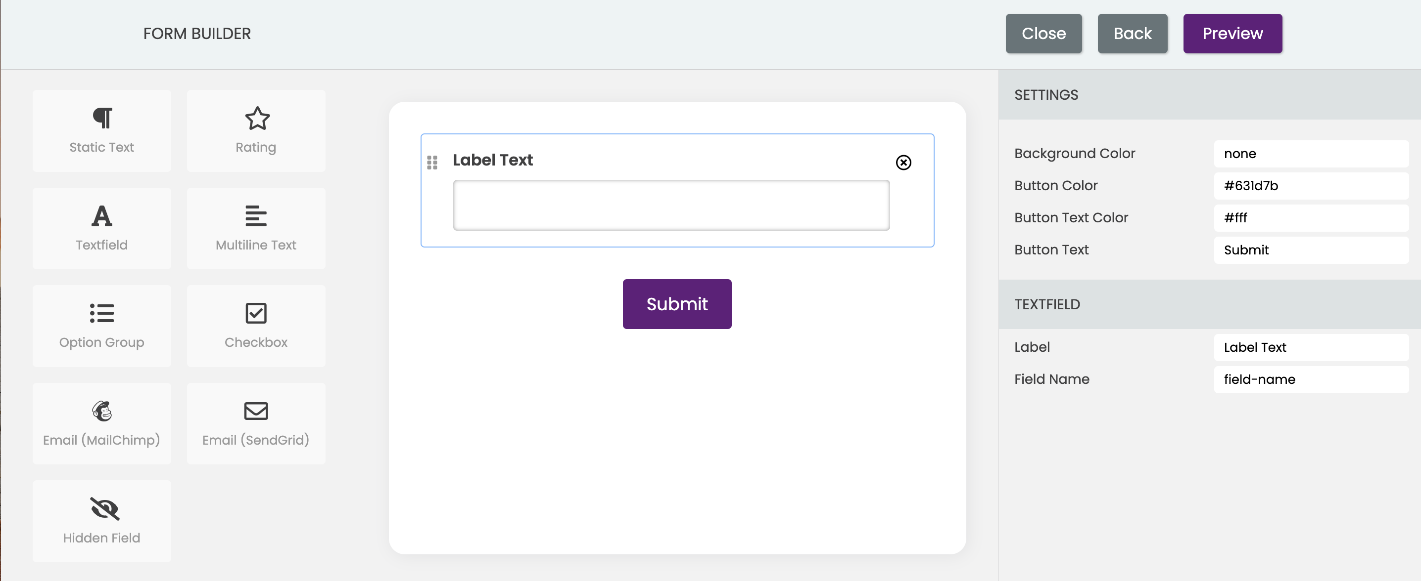
Form builder page makes it easy to create custom surveys with a simple drag-and-drop interface. Customize the appearance and formatting of your survey as desired. You can change the colors, fonts, and other visual elements to match your branding or preferences.
Our toolbox currently contains 9 widgets that can be used to create and design user interfaces. These widgets include:
- Static text displays fixed, unchanging text, and can be used to display headings, subheadings, labels, descriptions, or any other type of text that is not intended to change dynamically. They are commonly used in forms, surveys, and other types of user interfaces where it is important to provide context or guidance to the user.
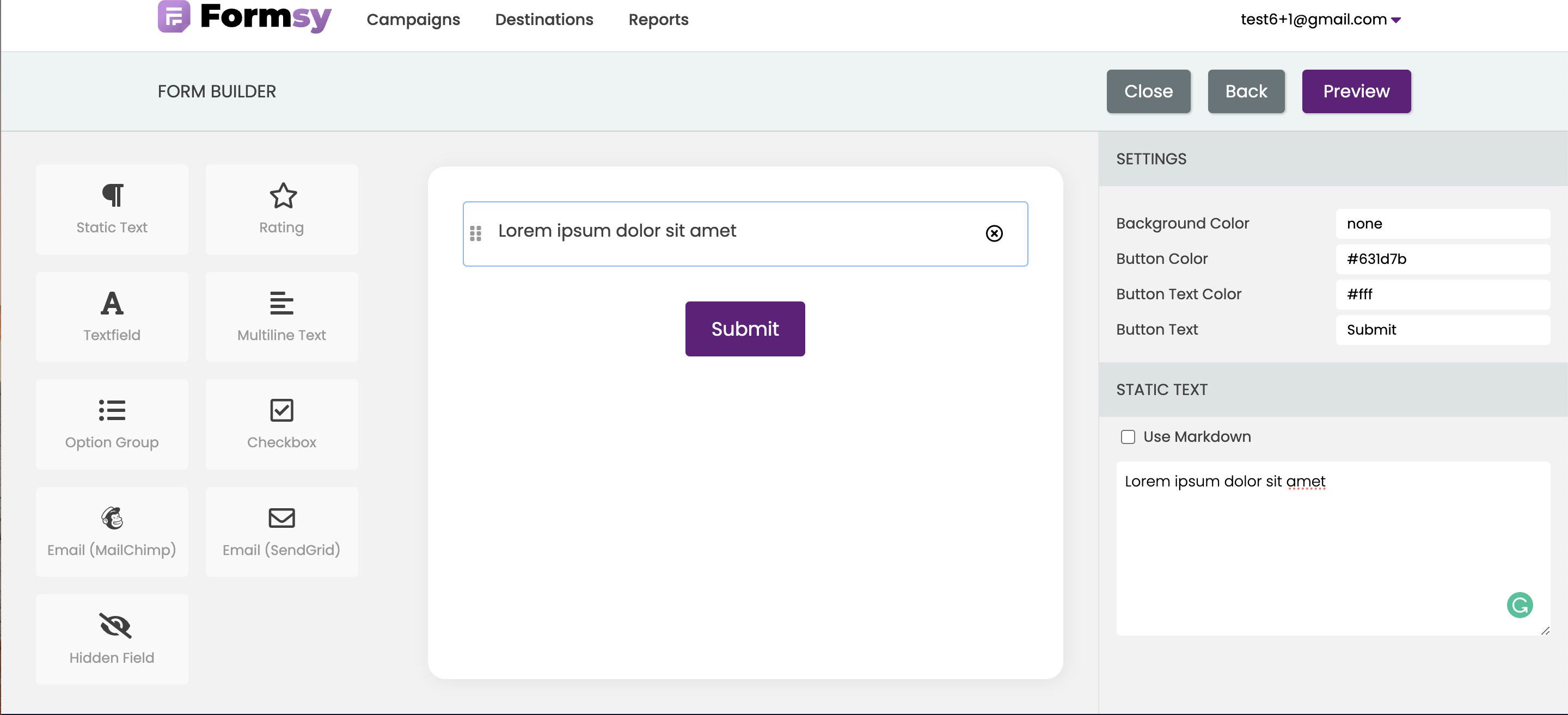
A markdown option is available for a static text widget, it means that you can use markdown syntax to format the text in the widget. This can be a useful feature if you want to add some simple formatting or styling to your text.
Learn more about Markdown
- Text field is a simple and essential component of forms and surveys, allowing users to enter text or data. It consists of a rectangular box with a label, where the user can type in text using a keyboard or other input device. You can customize Label and Field Name of Text field widget. You will see the specified Field Name in your responses.
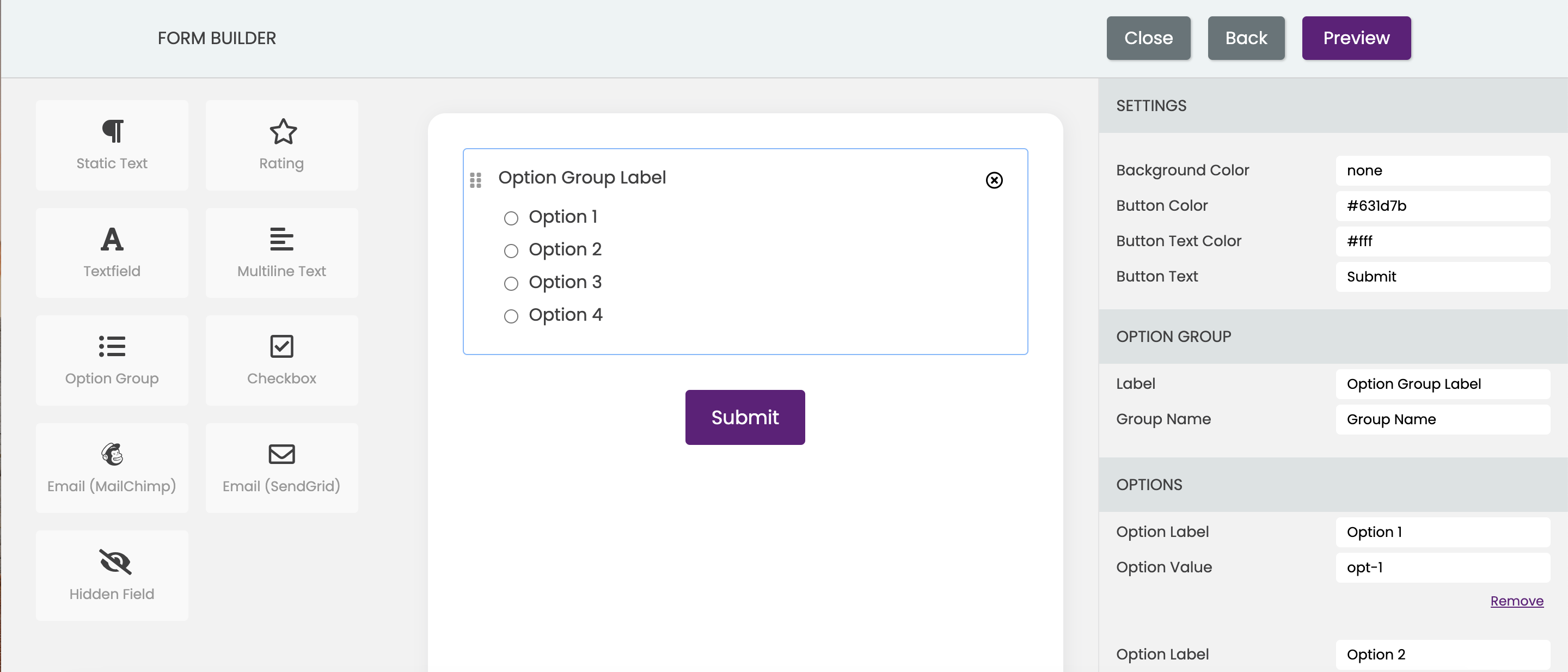
- Option group is a set of related options or choices to the user, which can be used to select a single or multiple options. It consists of a labeled group of radio buttons, where each button represents a distinct option. This widget is a versatile and powerful way to present and collect data in surveys, providing users with a clear and organized way to make selections.
Customize the option group widget by adding or removing options as needed, as well as updating the Label, Group Name, Label Text, Option Value for each option in the setting panel. You will see the specified Group Name and Option Value in your responses.
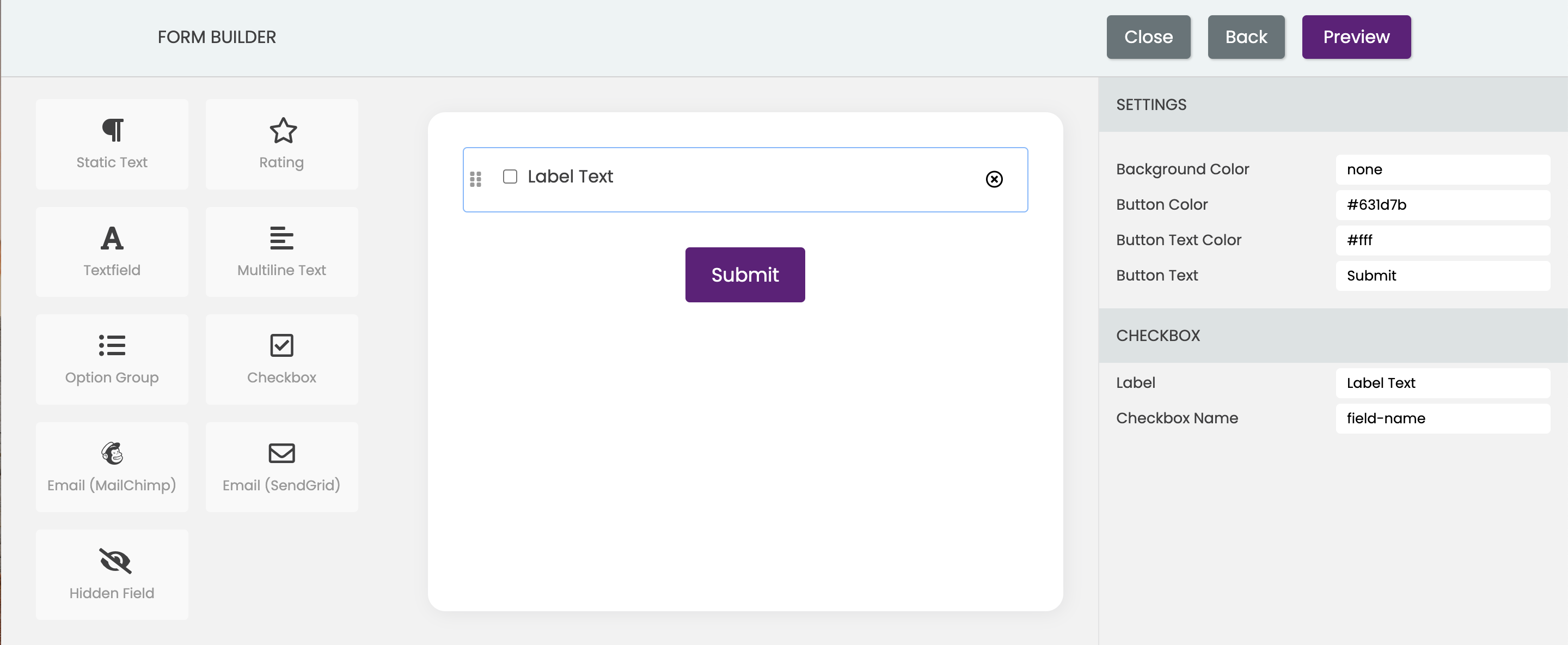
- Checkbox is a graphical user interface element that allows the user to select one or more options from a list of choices. It consists of a small box that can be checked or unchecked and is commonly used in forms or surveys to allow the user to indicate their preferences. You can customize Label and Field Name of Text field widget. You will see the specified Field Name in your responses.
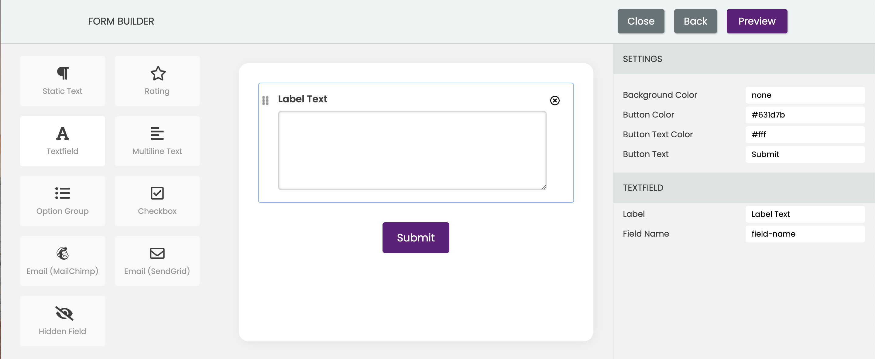
- Multiline widget allows the user to input or display text across multiple lines. It is typically used in applications such as text editors, chat applications, and email clients, where the user needs to input or view longer pieces of text. It's a rectangular box with a border and can be resized by the user to accommodate more or less text. It includes a scrollbar to allow the user to navigate through long text inputs or outputs. You can customize Label and Field Name of Text field widget. You will see the specified Field Name in your responses.
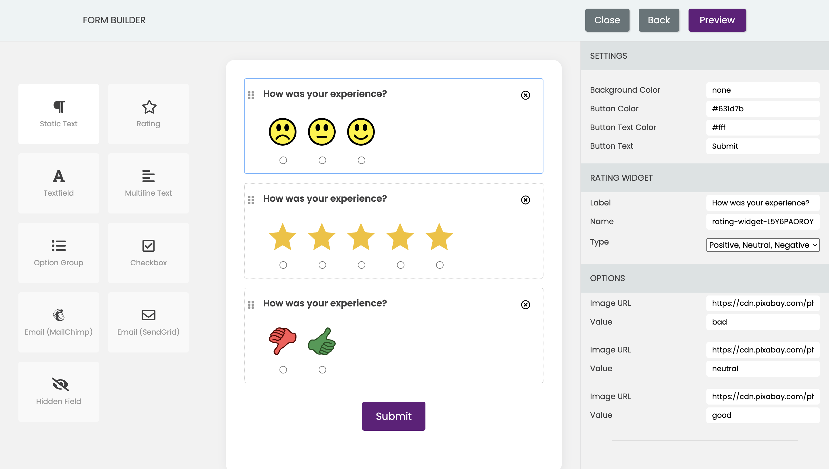
- Rating widget allows users to rate or rank items based on a predefined scale. The rating widget usually appears as a set of stars or other symbols that represent the rating scale, such as thumbs up or down, or smiley faces. The user can select a rating by clicking on the appropriate symbol, and the selected rating is then displayed visually.
Within the SETTINGS panel, you can personalize the rating widget. This can be achieved by choosing from four available types of widgets, including stars, positive/negative, number range, and positive/neutral/negative. Also, you can customize Label and Name of the widget. The specified Name will appeare in your responses.
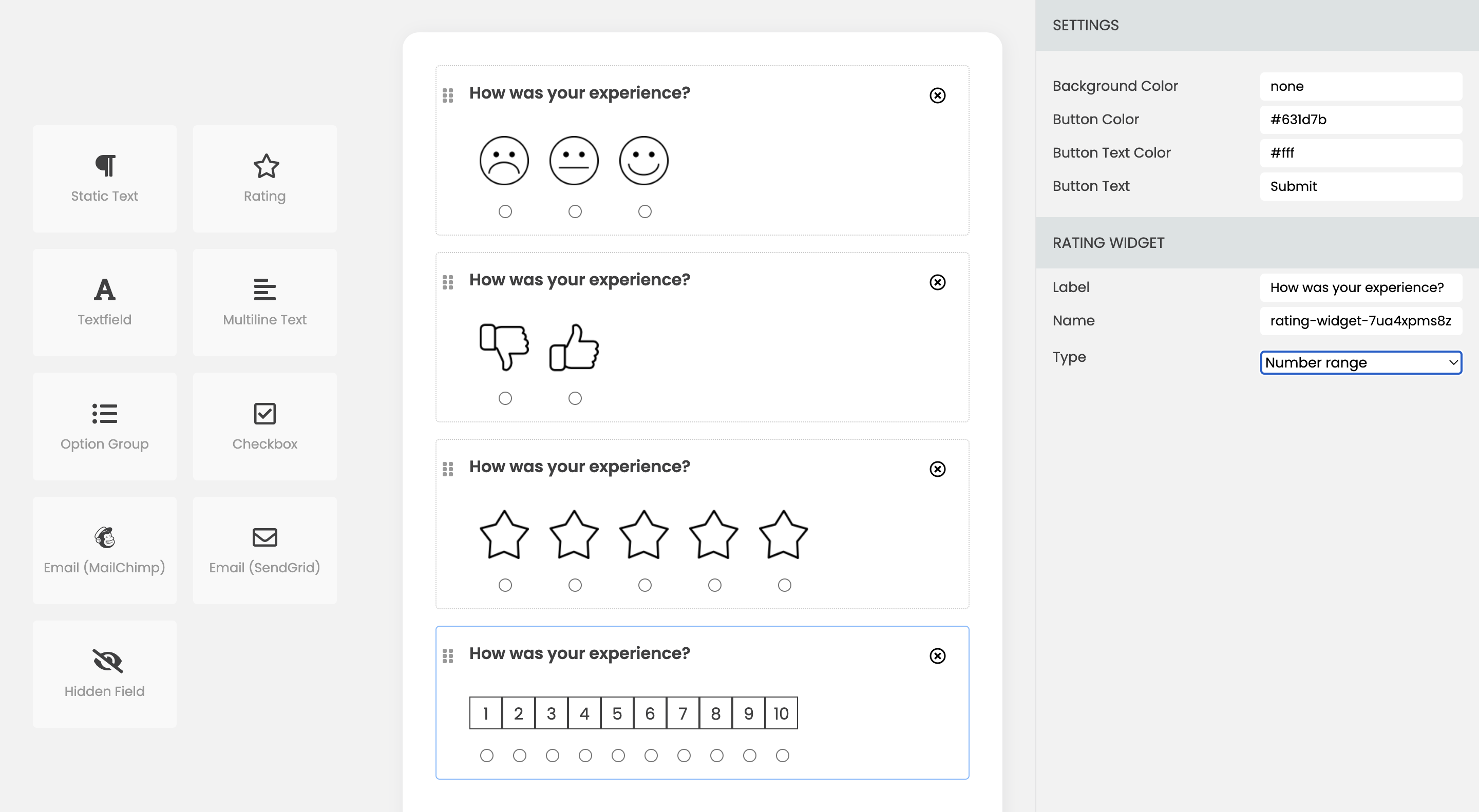
Additionally, it is possible to customize the appearance of the rating widget by specifying the URL for the image that are relevant to your specific application or brand.
Updating the image URLs for the rating widget can be done through a Settings panel within the Options section. To represent each rating level, simply insert the image URL for each rating level of the rating widget. This will replace the default images used for the rating levels with the images specified by the URL. By modifying the image URLs, you can easily update the look and feel of the rating widget to better match your design or branding requirements.
- Hidden field widget is used to store additional data or metadata about the survey response that should not be visible to the user. For example, you might use a hidden field to tag the response with a unique identifier for tracking or analysis purposes. You can specify Name and Value of Text field widget. You will see the specified Name and Valueand in your responses.

- Email (MailChimp) widget is only available for email campaigns and is used to auto insert the respondent's email in the response. It can be used for tracking purpose. You can specify Name and Value of Text field widget. You will see the specified Name and Valueand in your responses.
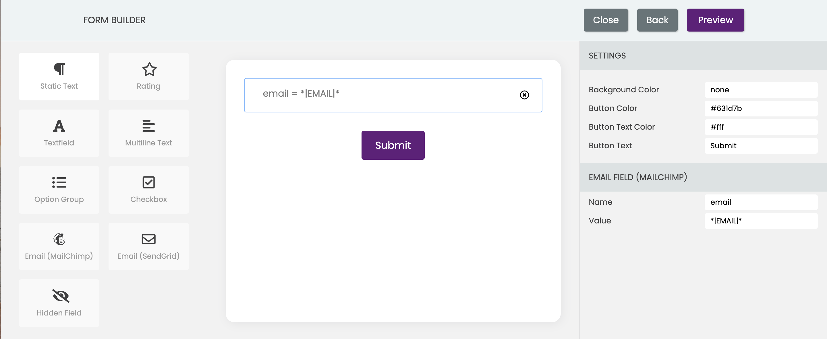
Please see the Mailchimp docs for details.
- Email (Sendgrid) widget is only available for email campaigns and is used to auto insert the respondent's email in the response. It can be used for tracking purpose. You can specify Name and Value of Text field widget. You will see the specified Name and Valueand in your responses.

Please see the SendGrid docs for details.
In addition, you have the option to customize the background color of the form as well as the button text, text color, and color.